We had a call from a Portland Oregon landscape maintenance company with a request to make their current website design mobile compatible. They were happy with their website design that was created by a local graphic designer 2 years ago. That designer was no longer doing freelance work which is why they gave me a call.
We scheduled a meeting to review their website and so I could fully understand their objectives.
I asked the owner what they wanted visitors to do when they came to their website. The owner explained that he either wanted them to call him or to fill out a form for a free estimate.

I asked where the phone number was and how they should request that estimate. Well the phone number is at the bottom of the page replied the owner and they should fill out the contact form if they want an estimate.
I asked him that if less than 20% of the people that come to a website will scroll to the bottom of the home page, how many people will actually see his phone number. How do people know that they should complete the contact form to get a free estimate? How will people know what geographic area he serves?
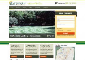
We agreed that we would retain the essence of the current design, but add in clear call to actions and add a service area map to communicate what areas he does work in.

We completed his new website in about 2 weeks using a WordPress responsive website design and adjusted the mobile version of the website and iPad versions to display exactly the way he wanted. The new website has the phone number visible at the top of the page, we added a web form for to request a quote. We added a service area map and we rescaled the content so visitors could immediately understand what they offer.
They were very happy with the results. Check out the new Earthborn Landcare website at http://earthbornoregon.com/
